It’s often said that England is the most densely populated large country in Europe – typically in discussions about the nation’s rising population, and the growing strain on public services. But it’s not true.
With 426 people per km², as of 2016, England is densely populated when compared to most other European countries. But it’s not as densely populated as the Netherlands, where there were 505 people per km², or a much poorer country such as Bangladesh, where there were 1,252 per km².
Yet simply dividing the number of people by the land area of a country is not always the best way to understand population density. Consider a country such as Russia, where urban density is high, but there are vast swathes of empty land. The figures will tell you density is very low (eight people per km²); but this it not what most people in Russia experience in their daily lives. The same is true of Australia, Canada and other large, highly urbanised nations.
That’s why I set out to understand the topic in more depth, using alternative measures of population density. I looked at 39 countries across Europe and came up with a set of statistics to help us understand settlement patterns in a more nuanced way. If you are interested in looking at this issue globally, I recommend Duncan Smith’s World Population Density interactive map, or the World Bank’s data comparison tool.
A bird’s eye view
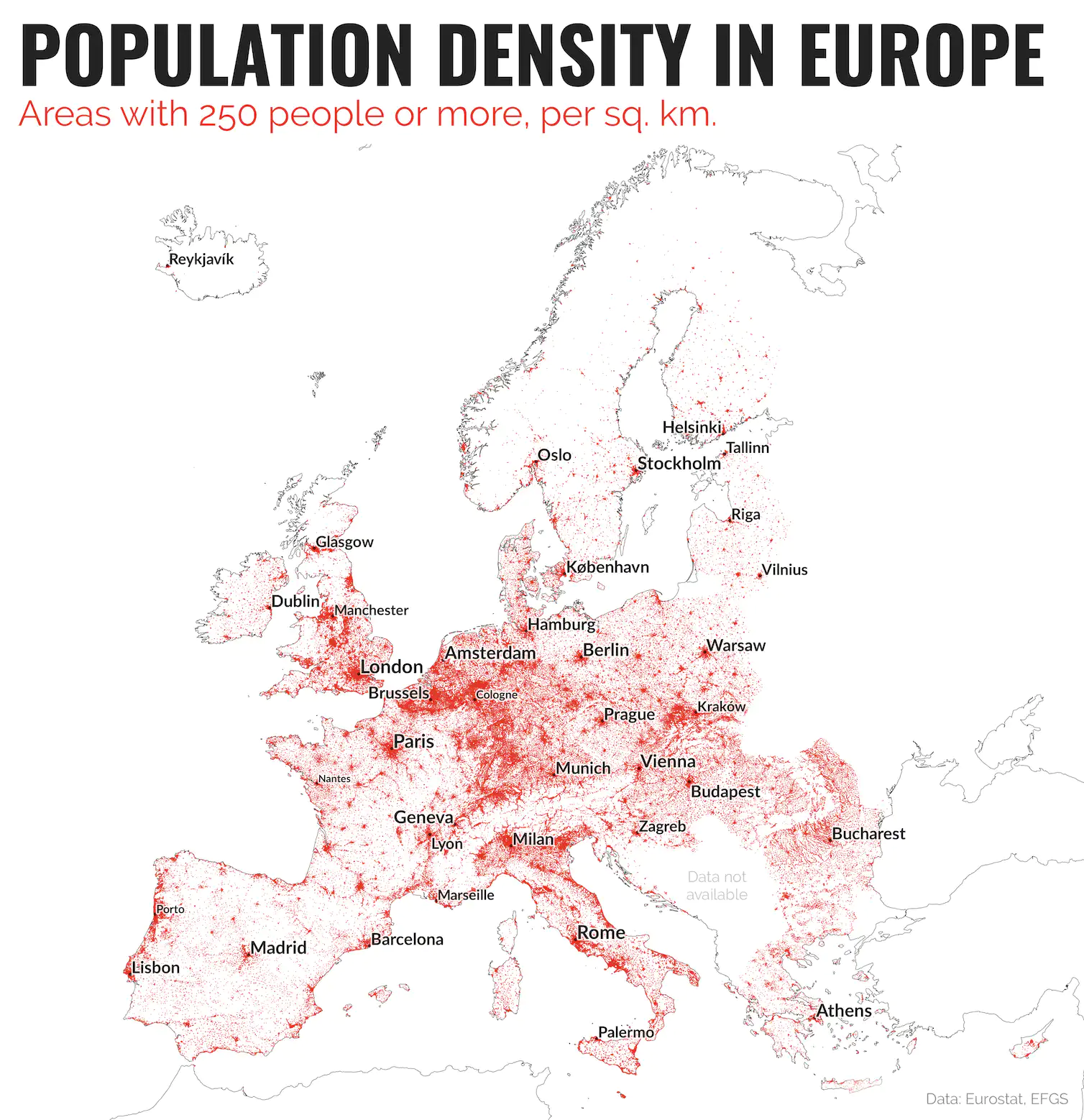
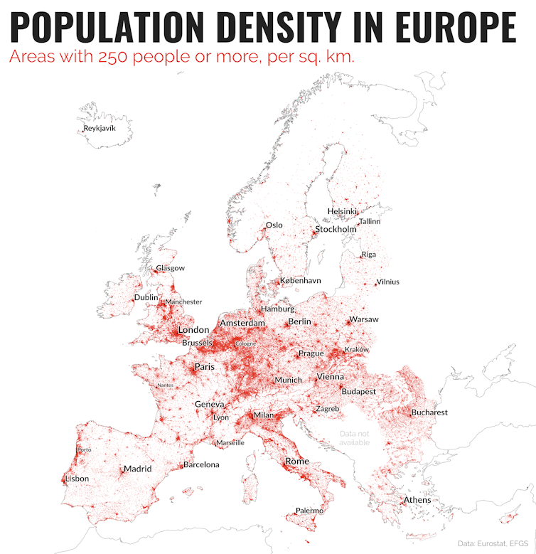
To begin with, I took Eurostat’s population density grid data for 2011 and mapped it. This divides Europe into areas of 1km², and then gives a population count for each area, so that we can compare like-with-like across Europe. As you can see from the map, it provides a good overview of where people live, and where they don’t live: notice the sparse settlement pattern in the Alps or northern Scandinavia, or indeed much of Spain.

European population density. Data: Eurostat. Mapping: by the author.
This bird’s eye view helps us to understand the wider context. For example, we can see an area of high population density extending in a rough arc from north-west England down to Milan, with a little break in the Alps. This is the so-called “blue banana”, or dorsale européenne (European backbone), identified by French geographer Roger Brunet in 1989, and it is home to more than 110m people.
But we can get further clarity still by honing in on “built-up” density, which takes into account only those 1km² areas with people living in them. I call this figure “lived density”, since it provides a way of seeing the kinds of population densities that people experience in their day-to-day lives, within built-up areas.
The Spanish distribution
A good way to understand this measure is to look at Spain. It has a population density of 93 people per km², giving the impression of a sparsely populated country. This is borne out in the map, where much of Spain appears to be empty; much more so than any other large European country.
The reasons for this date back to Medieval times, as Daniel Oto-Peralías at the University of St Andrews has explained. Yet characterising Spain as a sparsely populated country does not reflect the experience on the ground – as anyone who knows Barcelona or Madrid can tell you.
Spain contains within it more than 505,000 1km squares. But only 13 per cent of them are lived in. This means that the “lived density” for Spain is in fact 737 people per km², rather than 93. So even though the settlement pattern appears sparse, people are actually quite tightly packed together.
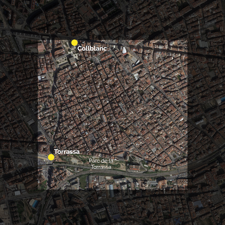
In fact, Spain could claim to be the most densely populated major European country by this measure, despite its appearance on the map. This also helps explain why Spain has the most densely populated km² in Europe; more than 53,000 people inhabit a single 1km² area in Barcelona. France also has an area with more than 50,000 people in a single km², in Paris.

Barcelona from above: possibly the most densely populated km² in Europe. Image: author provided.
There are 33 1km² areas across Europe with a population of 40,000 or more: 23 are in Spain, and ten are in France. England’s most densely populated km², in West London, has just over 20,000 people in it. Globally, the highest figure is close to 200,000, in Dhaka, Bangladesh.
See for yourself
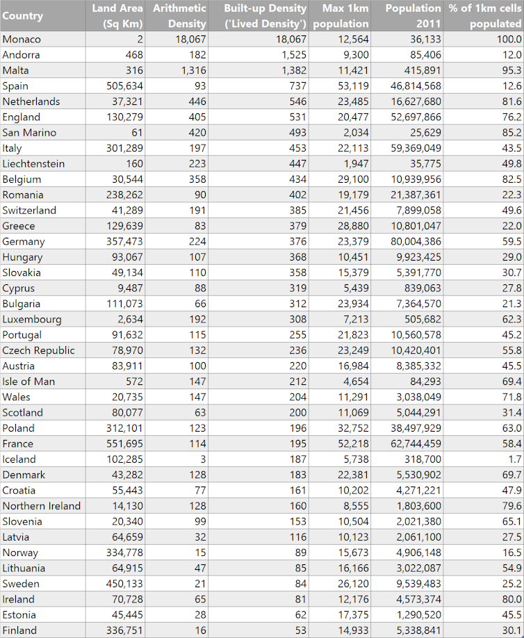
When we look at “lived density” across Europe, it’s fair to say that England is a densely populated country – but it still sits behind Spain and the Netherlands on the list of major European nations, and below the microstates of Monaco, Andorra and Malta. The lived density figure for the Netherlands is 546 people per km², compared to 531 for England, 204 for Wales, 200 for Scotland and 160 for Northern Ireland.
Although these population numbers are a little dated now (they are based on 2011 data), they can still demonstrate how population density figures might differ from what we experience in our day-to-day lives. Arithmetic population density measures can be useful, but on their own they don’t always help inform public debate, or match up with our perceptions of urban density.
I have provided the data for all 39 countries, where available, so you can compare the figures for yourself. By using a more sophisticated measure, we can gain a more nuanced perspective of settlement patterns and relative densities and, hopefully, better capture the reality on the ground in towns and cities.

Population density metrics. Data: Eurostat. Calculations by the author.
![]() Note: the final column shows how many 1km cells have people in them, but within that the level of density also varies, so this is not a “percent urbanised” measure.
Note: the final column shows how many 1km cells have people in them, but within that the level of density also varies, so this is not a “percent urbanised” measure.
This article by Alasdair Rae, professor in Urban Studies and Planning, University of Sheffield, was originally published on The Conversation.


