Here’s a tweet I spotted on my travels earlier:
Can’t help but think Harry Beck, who designed London’s tube map, wld despair at the map of today’s Overground line pic.twitter.com/M8osAIXke2
— Ed Conway (@EdConwaySky) September 2, 2016
It’s a good point – a point, in fact, I was pondering on an Overground train only yesterday evening. (CityMetric never sleeps.)
And so, since it’s Friday, here is a litany of things that really irritate me about that map.
It’s pointless
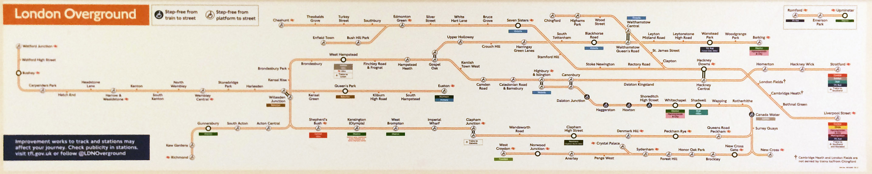
The Tube Map has a clear purpose. The Tube is London’s highest frequency, highest capacity railway, and the one that’s most useful in central London. And so, there’s a reasonable chance that the Tube map will show your journey.
None of that is true of this map. Want to get from Cheshunt to Canary Wharf? Sorry, the latter isn’t on there. Clapham to Camden Town? Well you could go all the way round the houses on the Overground, but to be honest you’d be better off getting the Northern Line. Trying to get almost anywhere in Central London? LOL, good luck.
What exactly is this map meant to be for?

The whole thing. Click to expand. Image: Project Mapping.
It’s showing off
Mind you, it’s only on trains anyway, not on platforms or apps or anywhere else you might go looking for a map. The odds of anyone ever being in a position to use this to plan their journey, even if they actually wanted to, are pretty minimal.
So why’s it there? Presumably just so that TFL can show off how big its rail empire has got. It’s the cartographic equivalent of willy-waving.
It’s just far too orange
Depending on how you count, the Overground now has somewhere between six and 12 different routes in its empire. (I’d call it seven – East London, North London, Watford, Gospel Oak-Barking, Chingford, Enfield/Cheshunt, Romford-Upminster – but mileage clearly varies.)
Yet TfL are still intent on bundling them all together and calling the resulting mess “Overground”. This not only makes the map hard to follow, and butt-ugly, to boot; it also means that you have no idea whether announcements about severe delays on the Overground mean a broken down train 15 miles away in Essex or “give up and hire a donkey”.
More lines are meant to be joining the Overground over the next few years. For heaven’s sake, TfL, find some other colours. Find some names even. Just stop pretending they’re all the same thing.
It’s also not orange enough

The tramlines as they appear on the tube map, contrasted with the solid colour of the District line.
Look, if you’re going to force us to look at so much of one bloody colour, can’t you at least fill the line in? Hollow tramlines get right on my nerve.
It doesn’t show a change between Seven Sisters and South Tottenham
They’re both right there, guys. They’re a four minute walk apart.

You ever changed at Green Park? Did it take you more than four minutes? You’re goddamn right it did.
Don’t make me take matters here into my own hands here.
The way the shape of the map forces all the lines to run horizontally
Showing all the lines paralleling each other makes everything cramped. Showing all the lines paralleling each other makes the map difficult to follow. Showing all the lines paralleling each other also results in…
Its complete and utter lack of geography
Okay, metro maps generally throw geographic accuracy to the wind – that was Harry Beck’s big idea, and well has it served us.
But this just takes the biscuit. West Croydon next to Clapham Junction? Cheshunt near Brondesbury? The two zone one stations so far apart they might as well be on different planets? It’s madness. Utter madness.
It doesn’t show a change between Camden Road and Camden Town
Okay, there’s a reason for this – Camden Town is so overcrowded it’s a miracle TfL haven’t started pretending it doesn’t exist at all, just to stop people using it – but nonetheless it’s the single most irritating absence on the map because that change would be really bloody useful.
The very fact of the Romford to Upminster line

Aww, look at the cute little thing. Which doesn’t go anywhere, doesn’t go there very often, and doesn’t even bother to connect up with the rest of the network.
Once Crossrail comes in, it’ll tie the network together a bit better…

…but at the moment it just looks stupid.
It has those confusing sword symbols next to London Fields and Cambridge Heath
The Lea Valley bit of the Overground is really two separate lines. One runs from Liverpool Street to Chingford; the other from Liverpool Street to Edmonton, with the trains then continuing alternately to either Enfield Town or Cheshunt.
The second of those sevices stops at every station on the way; the former doesn’t.

Well maybe you need a better map then guys? Eh?
No really, it’s pointless
Kind of repeating an earlier point here, I know, but seriously, what is the point of this thing? Why does it exist? Under what circumstances are we expected to use it?
What’s it for?
Other than giving me something to moan about on a Friday afternoon.
Oh well, I guess that’s something.
Jonn Elledge is the editor of CityMetric. He is on Twitter, far too much, as @jonnelledge.
Want more of this stuff? Follow CityMetric on Twitter or Facebook.


