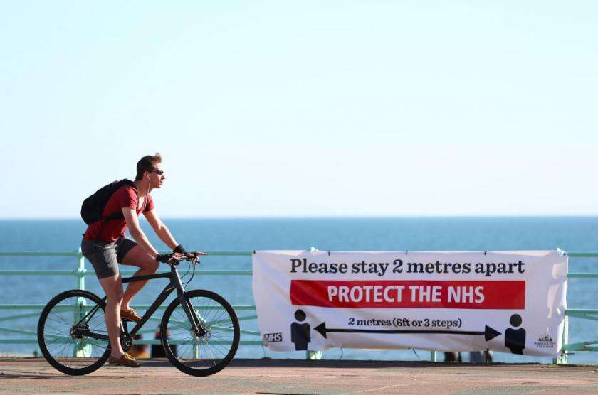
As the UK locked down amid the coronavirus outbreak, theories abounded about why some parts of the country changed their routines more quickly and to a greater extent than others.

Anonymised mobile phone data from Google shows that the amount people moved around for work dropped by more than 60% in Brighton, Bath, York and Edinburgh by 11 April. Those figures were notably lower, however, for Peterborough (47%) and Middlesbrough (50.1%).
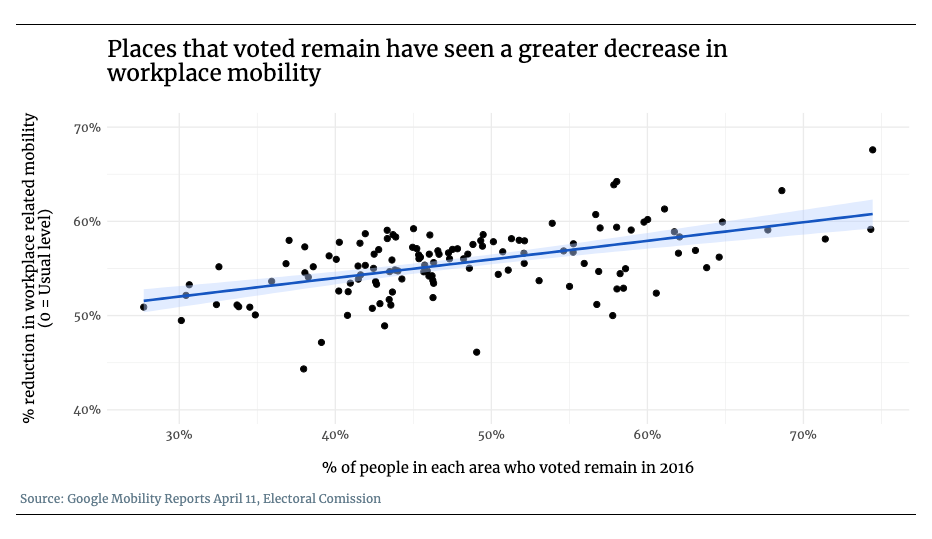
As in the United States and France, many have sought to explain different regions’ behaviours in terms of age, unemployment rates, or politics. Some in the UK have even looked to the Brexit referendum as a signal for a place’s willingness to adhere to distancing guidelines.
But the degree to which Britons have cut down on travel to work might have more to do with their job than their politics or their opinion of the lockdown.
The list of places that have seen lower drops in workplace mobility also have a higher proportion of residents doing manual labour, including sectors such as manufacturing and transport. Such jobs may not be possible to do at home, and might also be more likely to be deemed essential during a lockdown.
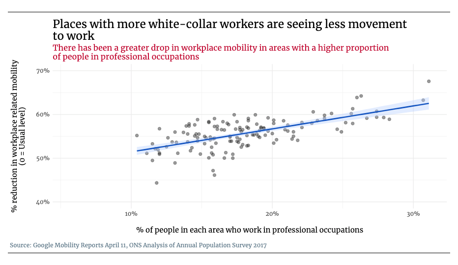
Conversely, areas that have seen the biggest drops in workplace-based movement tend to have more white-collar, office-based roles – jobs that might be easier to do at home or considered non-essential.
Edinburgh and Brighton, for instance, have some of the highest levels of professional workers out of all the UK areas for which Google provides data. Around 31% of people in those cities are employed in professional occupations, compared to 17% in Middlesbrough and 16% in Peterborough.
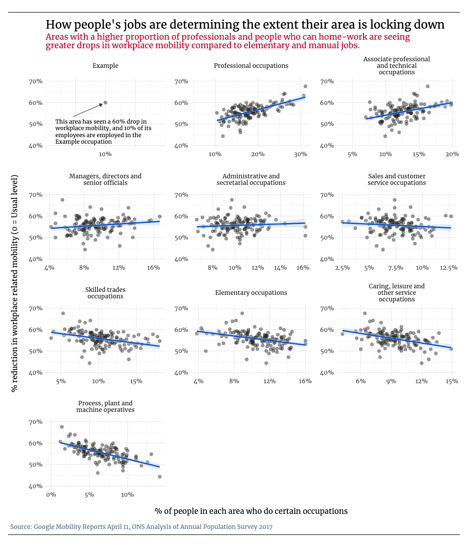
On the other hand only 1% of employees in Edinburgh and 3% in York are process, plant and machine operatives, according to the latest statistics from the UK’s Office for National Statistics (ONS). That compares to 8% in Middlesbrough and 9% in Peterborough.
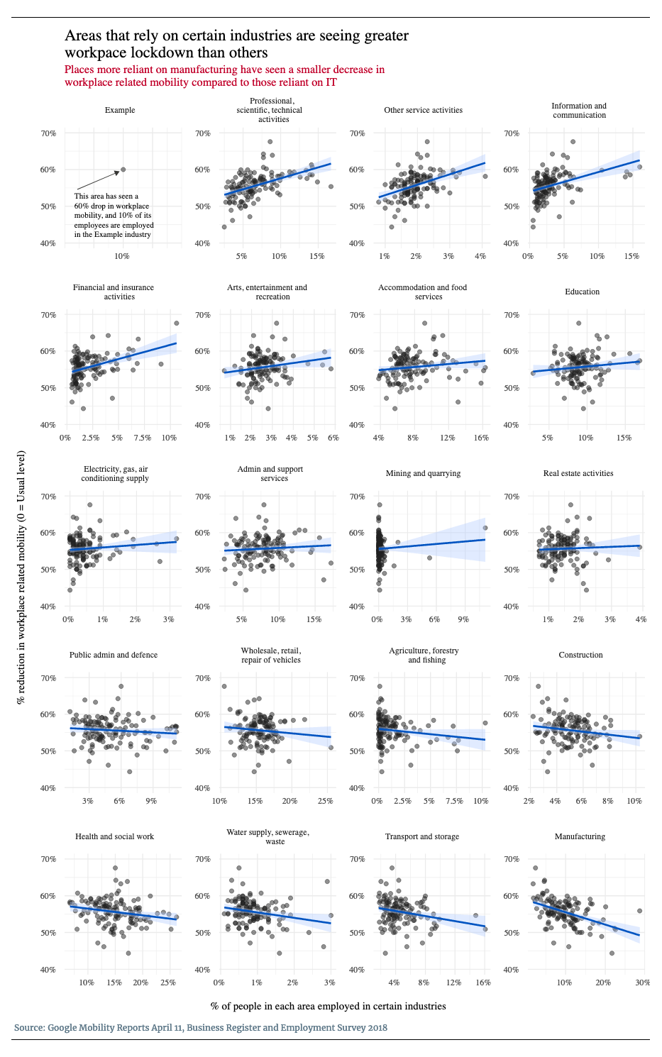
The charts below show how the proportion of workers in certain occupations relate to the levels of shutdown in UK towns, cities and counties.
Each dot on a graph represents a local authority, county or urban area in the UK. The vertical axis shows how much workplace mobility has declined – the higher the dot is, the greater the lockdown.
The horizontal axis shows the percentage of people in that area that work in each job or industry – the further to the right the dot is, the more the area relies on these workers as part of its overall “job mix”.
The chart below shows the relationships for all types of job, ordered from the strongest positive relationship to the strongest negative relationship. The trend is strongest for those at the beginning and end, and weakest for those in the middle.
As well as looking at individual job types, we can apply the same analysis across broad industries. Again there appears to be a relationship between the levels of employment in these industries and the level of workplace lockdown.
Places with a higher proportion of people working in professional scientific or technical jobs have seen larger drops in workplace activity, as have areas with more people in IT, service industries and finance.
On the other hand, places with a greater number of people working in manufacturing have seen lower levels of workplace shutdown.
The chart chimes with recent data from the ONS showing that people in professional occupations were among the most likely to work from home – with 45% saying they had done so at some point in the past.
Process, plant and machine operatives, however, were among the least likely: just 6% said they had worked from home in the past.
There are some significant caveats with the data, meaning we should be conservative about drawing too many conclusions.
Not every job or industry has seen a relation with workplace lockdown. There doesn’t seem to be a relationship, for example, between how many people in admin or secretarial roles work in an area and how much its workplaces have shut down. The same applies to people in managerial roles, and sales and customer service, as well as most broad industry categories. And the analysis doesn’t control for other things that might be affecting the lockdown, such as people’s age or education levels.
Statistics on occupations at local areas haven’t been updated since 2017, so it’s also possible that the jobs landscape has changed in some places since then.
It will be difficult to fully tell the story of lockdown until we have detailed survey data showing people’s behaviours. The data we do have seems to follow the idea that cities reliant on people who can work from home have been more successful at reducing the amount that people are moving around their city for work.
Michael Goodier is a data reporter at New Statesman Media Group, and Josh Rayman is a graphics and data visualisation developer at New Statesman Media Group.


