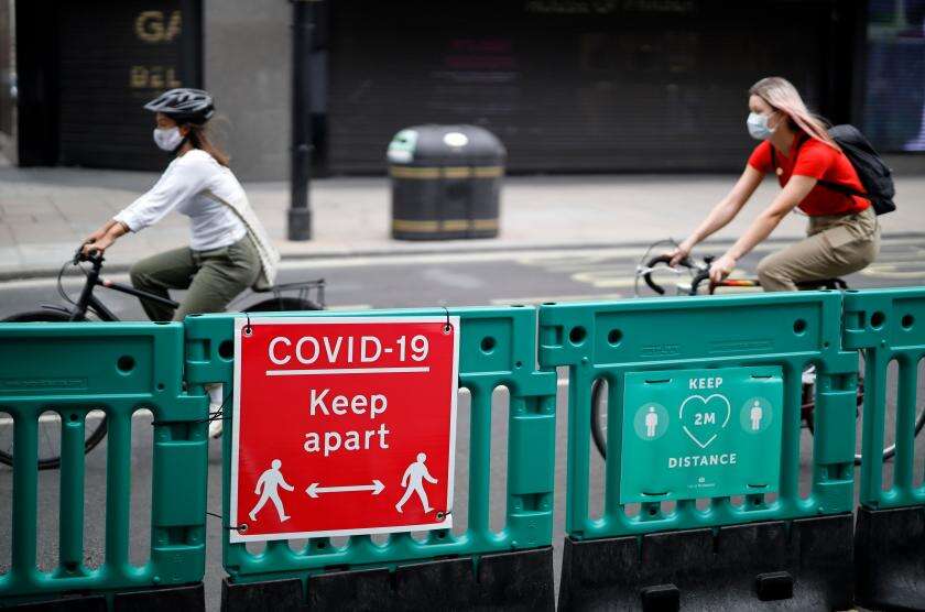
With Covid-19 still raging in the UK, fewer passengers are travelling by public transport, and Transport for London is rapidly rethinking its streets to accommodate a huge increase in cycling. Anyone hoping for an official map of the city’s growing cycling network will have been disappointed, however: So far, communicating the extent and the quality of the routes has been left to users.

One of them is cyclist and planner Dermot Hanney, who in 2016 published Route Plan Roll, a sort-of cycling equivalent of the tube map. In recent weeks, Hanney has been tracking London’s new cycle lanes as a Google Maps layer. City Monitor caught up with him to talk about the challenges of monitoring an area the size of Greater London, and why more cities should be mapping their cycle networks. The conversation has been edited for length and clarity.
Let’s start at the beginning. How did you end up doing this?
It was around the time Boris Johnson’s mayoralty was coming to an end [2016], when they started bringing in the really high-quality stuff. But there was a feeling that no one had a clue where these routes were going. There wasn’t really an inventory. It felt like there was a critical mass of routes that you could just about hang together as a network, which allowed a full map to become a thing.
Transport for London produces the tube map and a load of other maps of the city’s transport network – so why aren’t they doing this in house?
I think there’s a couple of things. Firstly, the problem is that TfL has to work with the boroughs, and don’t want to put their noses out of joint. If TfL produced a map based on quality, it’d mean bad-mouthing some sections of track the boroughs had done.

Secondly, TfL took the view a couple of years ago – I think this is coming back to haunt them a little bit – that it’s better for third parties to do app-based work and data-led work. So people like Citymapper and Google Maps have taken on that role of presenting wayfinding information.
But if TfL was more active on that, it’d be in a better position not only to represent the cycle tracks, but also to gather data on where people are actually cycling. So I think TfL really need to develop an app.
Of course, you can’t really keep looking at a map while cycling. How do you imagine people using your maps?
I see the schematic map as kind of an advertisement for cycling. It’s something that’s meant to be there to catch people’s attention, but it’s not really a tool to use as you go out the door. So what I’m trying to do now is put that information in the Google map, so people can follow more of a blow-by-blow account of where they move around.

Of course, the vast majority of people need to put their phone away while cycling. But at least with a Google Map, if you do feel you lost, you can stop, open up your phone, and say, okay, well this is where I am.
So where do you get your data from?
It’s a mix. Twitter keeps you up to speed – people tweet, “I’ve seen this new section go in today”, and with videos you can see a lot of what’s going on. That’s combined with things like Open Cycle Map, which have a lot of dedicated people, who put down all the routes.
And then whenever I get time I go out and try to cycle the routes. But some of them can be quite hard to gauge: You go down on a Saturday and it’s nice and quiet, but then you look on Twitter and find that at 5 on a Monday it’s hell because everyone’s using it.
Your map doesn’t just show the routes – it also tries to map their quality. How do you make those decisions?
It’s really a personal judgement, mostly based on the level of separation and protection on the route. At the moment I colour code the routes as red, orange, and green. The green, the highest quality routes, are really easy to capture. At the other end of the spectrum, red “routes” where there’s just nothing there, those are really easy to capture, too – I try to avoid highlighting those, but sometimes they’re the only way of getting between two points. Everything else is sort of in a bundle in the middle.

My ideal thing would be for people to come along and rate each section on a 1 to 5 scale, and then just use the average number. That’d be less arbitrary and would be a helpful resource to feed back to TfL and councils.
There are a few aggravating places where the official cycle routes just don’t quite link up – on the eastern fringe of the City of London, for example, CS2 gets to within 500m of CS3 but then just stops. But that’s obviously no use if you want to create a network, so how do you decide how to create those links?
I try to think of who’s going to be using the map. The main audience for the cycle map is probably people who are on the edge, thinking “I’ve seen other people do it”, but aren’t quite doing it yet. So I’m trying not to put down any links where people will be intimidated off the road and don’t want to cycle again. I probably err on the side of caution and use links that are a little bit less direct but have less traffic, rather than the quickest route.
Between CS2 and CS3 I think it’s Jury Street, because that has a contraflow cycle lane, and at least when traffic is bad it’s just not moving. So you can just about persuade new cyclists to use this section, but you probably have to be with them and hold their hand.
The map is so far focused on the city centre – how far out do you want to go?
I want to do the whole of London! What you find in outer London is that, a lot of the time, the links kind of exist, they’re just not finished very well, and there’s a lot of gaps in between. But if someone had time and just a little bit of money, there’s probably quite a lot of quick wins.
Also, we’re always focused on just cycling into London – but realistically, unless you’re really dedicated, you’re not going to do that whole cycle in from, say, Bromley. But there’s loads of town centres in outer London – or you could get people to cycle to the railways station and then get the train in from there. The opportunity is there to develop a local network, more focused on trips within the borough rather than into the city. Hopefully with a single map of the whole of London, people can take what they need from us to help their local cause and their local needs.
Are there other cities internationally you’ve been looking at for inspiration?
Not really – that’s one of the reasons I wanted to do the schematic map, it felt like a really big gap. If you go to Paris or Berlin or Rome, the first thing you do is get the metro map out and go, okay, that’s where that is, this is where I’m staying, this is how I’m going to get around town. I’ve always felt there’s no equivalent for cycling.
So I guess one of the things at the back of my mind is that, if I wanted to be super aggressive in expanding, I’d like to have all these different maps for different cities and for people to go, okay I’m cycling in Europe, I need a cycle map – let’s go to Route Plan Roll.
Jonn Elledge was founding editor of CityMetric. He is on Twitter as @jonnelledge and on Facebook as JonnElledgeWrites.


