Oh, hey, this is cool. Researchers at the University of Manchester have made their own map of the city’s tram network.
It doesn’t address any of our concerns about the readability of the network (boo). But it does do something else.

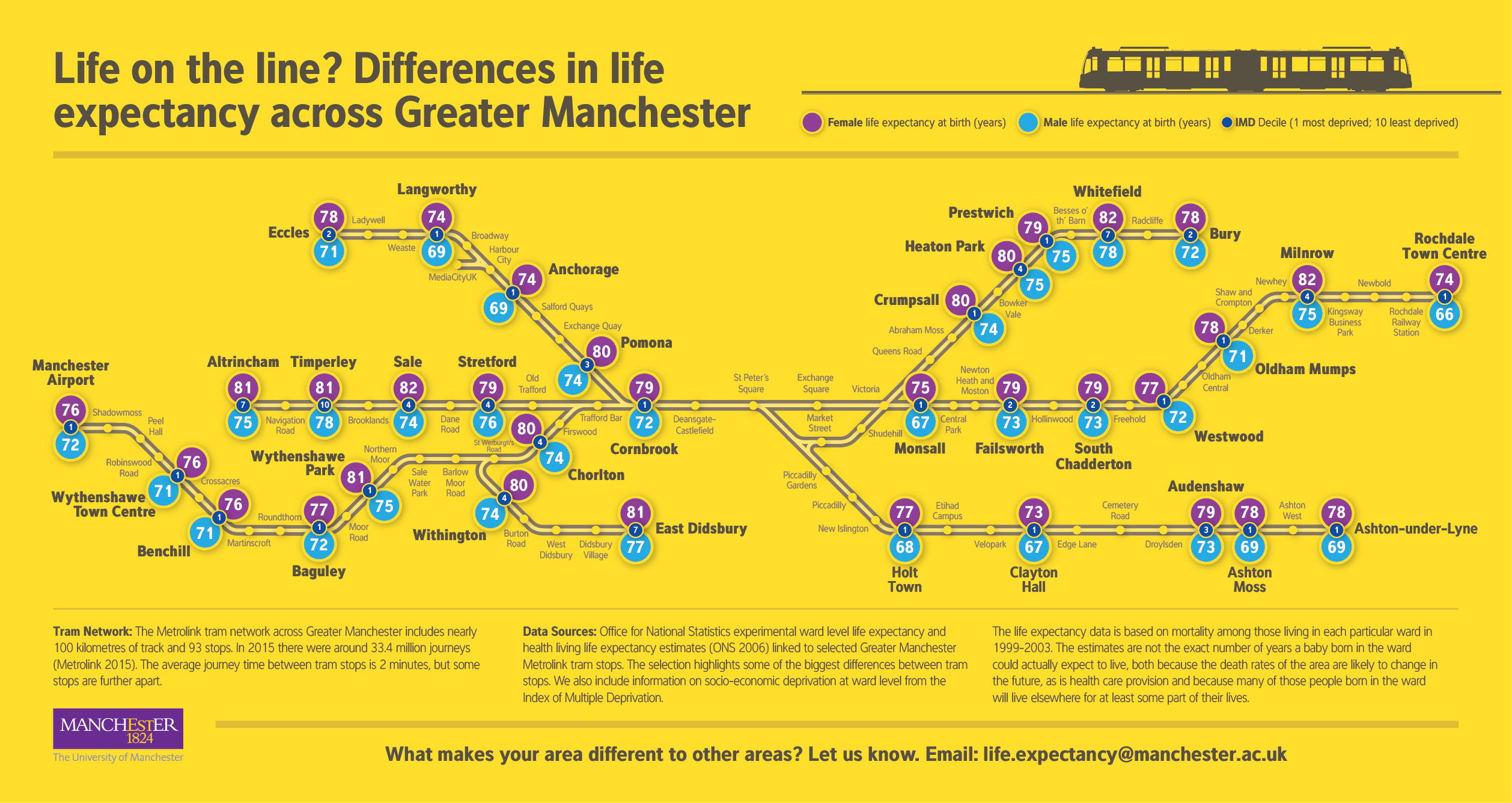
Click to expand. Slightly. Ful size version here.
The purple blobs are female life expectancy at selected stops; the light blue ones are (lower) male life expectancy. In between there’s a tiny dark blue number, showing how deprived the area is: basically, high numbers are rich, low numbers are poor.
And would you believe it, there seems to be a correlation. In well to do areas, like Didsbury and Timperley, people tend to live longer. As lead researcher Kingsley Purdam noted in a blog about the research:
The journey from Timperley to Rochdale (one of the most economically deprived areas of Greater Manchester, where life expectancy is 69.4 years) can take around 75 minutes for a journey of 26 kilometres, but the difference in life expectancy between the areas is more than a decade – around a year for every 7 minutes.
He goes on to note:
The life expectancy gap between men and women is striking at the local level. For example, in Timperley life expectancy for men is estimated to be 78.3 years compared to 81.3 years for women – a difference of 3 years. However in Rochdale life expectancy for men is estimated to be 65.7 years compared to 74.3 years for women – a difference of 8.6 years.
It’s a pretty striking illustration of how deprivation can vary within a single city. It reminds me of this piece of work, by James Cheshire and Oliver O’Brien – two researchers at UCL’s Centre for Advanced Spatial Analysis – which plots life expectancy by tube station. The shading shows reflects deprivation in individual areas:

(Full, interactive version available here.)
The similarities are not a coincidence. The two projects both have variants of the name “Lives on the line”, and Purdam’s blog links back to the London version, suggesting it was an inspiration.
What both projects show, I think, is metro maps can be a really useful device for helping to communicate aspects of a city that have nothing to do with transport. The geography it represents may be distorted, but it’s also more recognisable through familiarity. That makes the difference in life expectancy between Rochdale and Timperley hit home.
Just one more way in which cities without decent transport are losing out.
Jonn Elledge is the editor of CityMetric. He is on Twitter, far too much, as @jonnelledge.
Want more of this stuff? Follow CityMetric on Twitter or Facebook.


