When I was a child, because I was really cool, it used to bother me that there was no diagrammatic map of London’s mainline railways.
There was a map of the tube network of course, but many of the stations closest to my house weren’t on the tube. The incompleteness of it irritated me. Why wasn’t the London underground map complemented by a British Rail one showing the rest of London’s rail network?
I was an only child, in case you were wondering.
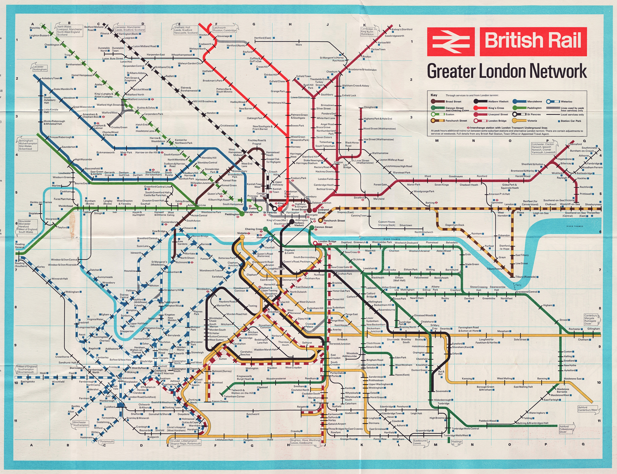
Anyway, this week I’ve learned that the map I always wanted actually used to exist. And, now I’ve seen it, it’s bloody obvious why it wasn’t better known. It dates from the 1960s, and here it is:

Click to expand.
The problem with the map, now I can actually see it, is it’s not clear what it’s actually for. It’s quite useful if you want to know which order the stations on a particular line are in; it’s quite useful if you want to know how to get to one of the city’s many commuter suburbs that are only served by mainline trains.
But the fact it doesn’t show the tube at all – Why not? Was it pique? Was it designed by an idiot map-obsessed 11 year old boy? – renders the map largely useless. If you want to travel from one side of the map to the other, or if your journey starts or ends anyway in central London other than right next to the relevant mainline station, then this map just doesn’t contain the information you need to plan your route. For the vast majority of journeys, you need the tube map, too.
Which is silly. That’s presumably why this map never caught on, and we got the London Connections map, which shows everything, instead.
Anyway, it’s an interesting curio for those who are into that sort of thing, and since you’re reading this, I assume that you are. Here are some other observations:
It’s titled the “Greater London Network”, but it’s a funny definition of Greater London, stretching from Reading to Southend and Gatwick to Bedford. It actually covers the whole of the metropolitan area – which, since metropolitan areas are basically the same as commuter belts, is no real surprise
The map colours the lines based on which London station they terminate at, and at this time there were 13 London termini, so that’s 13 colours (plus a few other styles to show peak-only services and local branch lines).
But in the olden days, printers apparently didn’t have enough colours to cope with that complex a network, so five of those colours are repeats, only they’re broken up with white blocks.

Colouring the map using terminals sort of works, though: you can see the shape of the network in south London far better than you can on the current version, which seems to think you care more about corporate brands than destinations. Which is obviously nonsense.
There’s no Thameslink line, running north south across central London, yet: that didn’t open until 1988. Back in the sixties, the line to the north terminated at St Pancras; the one to the south at Holborn Viaduct. The latter name is far better than the current title of City bloody Thameslink, though.

The South London rail network is such that lines on many routes can actually serve multiple termini. Despite this, though, the Holborn Viaduct lines serve very similar destinations as those served by Thameslink today: a loop involving Wimbledon and Sutton (though at this time continuing to Victoria), and a branch to Sevenoaks via Catford.
Oh, and while we’re looking south, in this era, the Bromley North branch wasn’t a local service, but continues onto the mainline towards London Bridge.
Up in north London, the lines that are now part of the Overground all looked very different. For one thing, the Gospel Oak to Barking line doesn’t make it to Gospel Oak, instead terminating at Kentish Town.

There’s no Dalston-Stratford line: instead, it turns south and terminates at Broad Street, a long demolished station that used to be next to Liverpool Street. Once upon a time it was London’s third biggest terminal, beaten only by Liverpool Street and Victoria; and Broad Street services served Watford and large chunks of north London. By the time of this map, though, the station was already in decline. It’s since been demolished, and replaced with the Broadgate office complex where various banks live.
Meanwhile, some St Pancras line trains continued via Farringdon, following the Circle line onto Moorgate – a branch that was part of Thameslink as late as 2009.
The map also shows various other closed stations and dead branches. Lea Bridge, to the north of Stratford, has been closed for decades but will re-open soon. Outside London, there’s also a branch south of High Wycombe, another from Welwyn Garden City to Dunstable, and another west from Watford (again, this one’s on its way back).
There’s no doubt more we haven’t spotted. You can see the whole map, in all its not-quite-technicolour glory, here.


