We set out to understand how large metro areas in the US compare with one another in terms of housing security – specifically in light of Covid-19 – by analysing several key indicators. While such an index can hope to be representative, it can never be exhaustive.
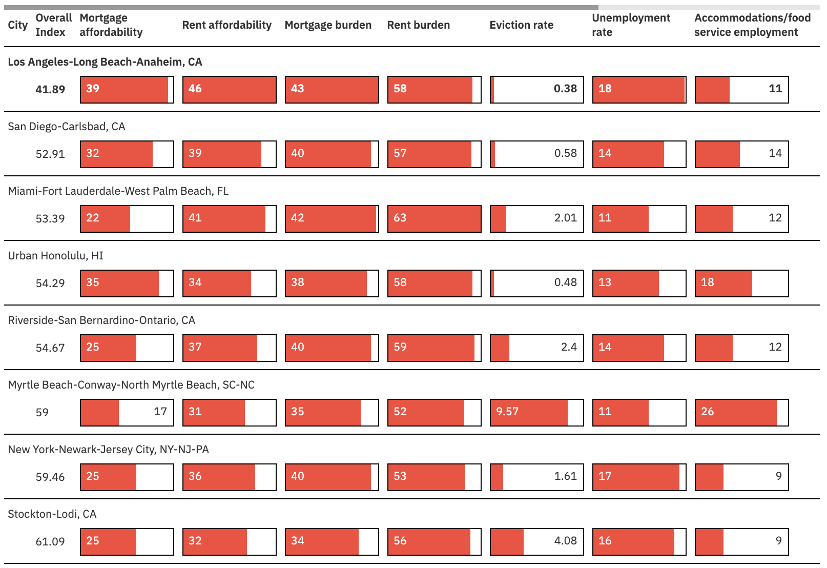
This index is based on ten indicators across 84 large US metro areas (those with a population of 500,000 or more and for whom data for all ten indicators was available). You can interact with the index above and read the story about our findings.
Methodology
Through interviews with experts, we were able to identify indicators that most strongly relate to housing security. Each indicator we used was weighted based on its perceived importance.
Here are the indicators we used, in order of how heavily they were weighted in the final calculation:
- mortgage affordability, Q2 2019
- rent affordability, Q2 2019
- mortgage burden, 2019
- rent burden, 2019
- eviction rate per 100, 2016
- current unemployment rate, June 2020
- percent employment in accommodations and food service, 2019
- dependency ratio: non-working to working-age population, 2019
- labour force participation rate, 2019
- real GDP, annual growth, 2018-2019
The raw data for each metro was compared with all other metros and rescaled to a score between 1 (worst) and 10 (best). The weight of each indicator was then applied to each score to produce the weighted score. The sum of the weighted scores gave the overall index score. These scores were then rebased so the top-scoring location scored 100 (overall weighted score).
Why these indicators matter to housing security
Not all of the indicators one would ideally want for an index of housing security are available for all US metro areas. Of the indicators we did use, we included not only housing-specific measures but also wider economic and employment measures. Interviews with experts in housing and housing displacement as well as economists helped refine and contextualise our indicator choices and weightings.
Below is more information about each indicator that made it into our index.
Mortgage and rent affordability, Q2 2019
Mortgage affordability is the percentage of monthly income that a resident making the average median income would need to have on hand for a median-priced home. Rent affordability is similar but pertains to median monthly rent instead of down payments and monthly mortgage costs. People who already have a high percentage of monthly income going to mortgage or rent payments are likely to have less monthly income to direct toward savings and emergency funds; they are therefore more vulnerable in the face of job loss and other economic insecurities brought about by Covid-19.
This data comes from Zillow.
Mortgage and rent burden, 2018
Burden is the percentage of households that spend 30% or more of their income on mortgage or rent. These measures differ from affordability because they focus on the more distressed households on the income-to-housing cost spectrum. For example, a homeowner earning median income in McAllen-Edinburg-Mission, Texas, spends on average 12% of income on mortgage payments. However, nearly 36% of McAllen-Edinburg-Mission households are spending 30% or more of income on mortgage.
This data comes from the US Census Bureau’s ACS five-year estimates.
Eviction rate, 2016
Eviction rate is the number of renter-occupied households in an area that received an eviction judgment in which they were ordered to leave, divided by the total number of renter-occupied households. Though the Eviction Lab has started collecting more-timely data on evictions, due to barriers in data reporting, they only track current numbers for 17 cities. Eviction rates for 2016 were the most timely data covering almost all US cities.
Areas with higher eviction rates pre-Covid were determined to be more at risk for high numbers of evictions once Covid-era eviction moratoriums lapse.
Data caveat: eviction rates are available on a Census Place level, while all other indicators are on the Census MSA level.
This data comes from the Eviction Lab.
Current unemployment rate, June 2020
Current unemployment rates are taken from the June 2020 US Bureau of Labor Statistics metro-area report and express the percentage of the population that is unemployed. Cities with higher unemployment will have more people who struggle to keep up with rent and mortgage payments.
Percent employment in accommodations and food service, 2019
Some jobs are more susceptible to Covid layoffs: among them jobs in accommodations and food service. Cities where higher percentages of the population depend on this type of employment will have more people with lost wages and missed rent and mortgage payments.
This data comes from the US Bureau of Labor Statistics Quarterly Census of Employment and Wages.
Dependency ratio: Non-working to working-age population, 2019
The dependency ratio we used in this index was the ratio of non-working to working-age population. Metros with high dependency ratios have a less stable balance of workers to non-workers, meaning that a single person may support many non-working family members. Covid layoffs could affect these populations more by putting the sole breadwinner out of work.
This data comes from GlobalData.
Labour force participation rate, 2019
Labour force participation rate is the percentage of the working-age population that is either working or looking for work. Metros with low labour force participation rates have fewer labour resources to draw on to produce goods and services to recover distressed economies.
This data comes from GlobalData.
Real GDP, annual growth, 2018-2019
Real GDP is the inflation-adjusted measure that reflects all of the goods and services produced by a metro in a given year. The annual growth in GDP is how much the value of those goods and services has increased over time. Cities with low real GDP growth were already experiencing economic instability before Covid-19 hit and are likely to experience sharper economic impacts from Covid-related job loss and business failures.
This data comes from GlobalData.
Missing data
There were 25 metro areas removed from our final analysis due to missing data. Without complete data across all variables, these metros would not have been comparable to the metro areas that had full data coverage.
Below is the list of metros that were removed:
- Fayetteville-Springdale-Rogers, AR-MO
- Little Rock-North Little Rock-Conway, AR
- Albuquerque, NM
- Birmingham-Hoover, AL
- Boise City, ID
- Bridgeport-Stamford-Norwalk, CT
- Buffalo-Cheektowaga-Niagara Falls, NY
- Cape Coral-Fort Myers, FL
- Chicago-Naperville-Elgin, IL-IN-WI
- Deltona-Daytona Beach-Ormond Beach, FL
- Durham-Chapel Hill, NC
- Indianapolis-Carmel-Anderson, IN
- Kansas City, MO-KS
- Knoxville, TN
- Memphis, TN-MS-AR
- Oxnard-Thousand Oaks-Ventura, CA
- Palm Bay-Melbourne-Titusville, FL
- Phoenix-Mesa-Scottsdale, AZ
- Portland-South Portland, ME
- Provo-Orem, UT
- Rochester, NY
- Santa Rosa, CA
- Spokane-Spokane Valley, WA
- St. Louis, MO-IL
- Tulsa, OK
Acknowledgements
Glenn Barklie, chief economist at New Statesman Media Group, and Tim Thomas, research director at the Urban Displacement Project, offered valuable context and guidance in the creation of this index.


